Burn Rate Trends: Creating Early Warning Dashboards for Startups
Early warning dashboards track burn rate trends before they become crises. Learn how to build real-time visibility into your cash burn, identify concerning patterns, and take corrective action with months of runway to spare.
Why Burn Rate Trends Matter More Than Absolute Numbers
Most founders focus on their monthly burn rate as a static number: "We're burning $150,000 per month." But this misses the critical insight: the trend. A startup burning $150K while growing 20% month-over-month tells a completely different story than one declining in revenue while increasing expenses by 10% monthly.
Trend analysis reveals whether your business model is maturing toward sustainability or accelerating toward a funding crisis. When you track trends, you're not just recording the pastyou're creating a predictive model of your future. A rising burn rate trend gives you six months or more to course-correct. Ignoring it leaves you scrambling for emergency funding with weeks of cash left.
The entrepreneurs who survive downturns aren't the smartestthey're the ones with early warning systems in place. They see the trend line bending and adjust spending or fundraising plans before it becomes an emergency.
Building Your First-Level Dashboard: Monthly Burn Rate Tracking
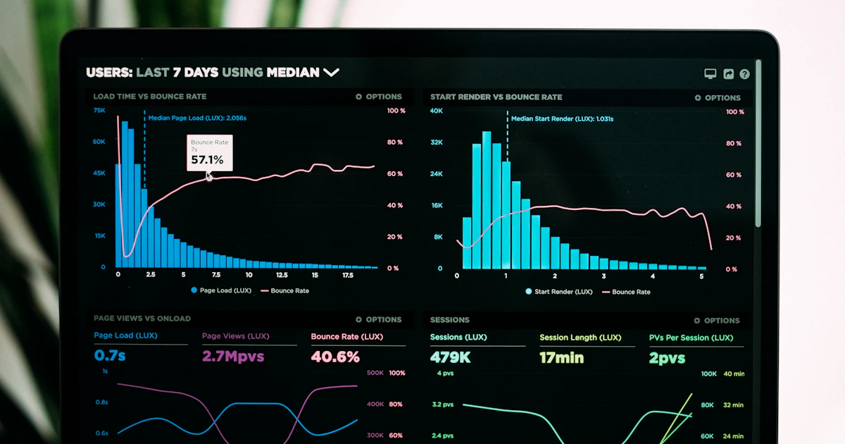
Start with the simplest useful dashboard: a 12-month historical view of monthly cash outflows alongside revenue and headcount. This three-variable view tells you how efficiently you're converting payroll and operating expenses into business results. For a deeper dive, explore the Be Ready book series.
Create columns for: (1) beginning cash, (2) total cash outflows, (3) total revenue, (4) ending cash, (5) headcount, (6) burn rate. Calculate (6) as total outflows divided by headcountthis normalizes for team growth. Plot these on a simple line chart: burn rate on the primary axis, headcount on the secondary axis.
If burn rate rises while headcount stays flat, you have expense creepmore servers, more tools, more contractors. If burn rate rises proportionally with headcount, you're hiring at reasonable cost per employee. If headcount rises but burn rate falls, you're hitting efficiency gains that offset salary increases. Different patterns require different responses.
Update this dashboard weekly with best estimates. You won't have exact numbers until month-end, but weekly estimates reveal trends faster than waiting for month-end close.
Adding Predictive Power: Burn Rate Velocity and Acceleration
Velocity tells you the rate of change. Acceleration tells you whether that change itself is speeding up. A startup might be burning $150K one month and $160K the nextthat's velocity. But if the increases are accelerating (5K one month, then 7K, then 10K), you have a bigger problem than linear growth.
Calculate velocity by taking the month-over-month change in burn rate. Plot this over time. The goal is a flat or declining velocity line, meaning your burn rate is either stable or improving. An upward-sloping velocity line is a serious warning sign.
Acceleration is the change in velocity. Calculate it by looking at whether your month-over-month changes are getting larger. If your velocity increases are accelerating, you're in a cascadeeach month's increase is larger than the last. This requires immediate intervention.
Most dashboards stop at velocity. Adding acceleration lets you distinguish between "we're slowly burning more" (manageable) and "we're increasingly burning more faster" (crisis requiring intervention in weeks, not months).
Runway Forecasting: From Historical Trends to Future Scenarios
Once you've established your baseline burn rate trend, project it forward. If your current cash balance is $500K and you're burning $150K monthly with acceleration of 5%, how many months of runway do you have?
The simple calculation ($500K ÷ $150K = 3.33 months) is dangerously wrong if you have acceleration. With acceleration, month 1 you burn $150K, month 2 you burn $157.5K, month 3 you burn $165K. Total: $472.5K. You're out in month 3, not 3.33 months. This matters.
Build a forecast model with three scenarios: (1) burn rate stays flat, (2) burn rate grows at historical average, (3) burn rate grows at worst-case observed pace. The gap between scenario 1 and scenario 3 shows you your true risk range. If scenario 1 gives you 8 months of runway but scenario 3 gives you 4 months, you need a fundraising plan with 5-month lead time, not 7 months.
Update these scenarios monthly. As real data comes in, your worst-case scenario might improve or deteriorate. That tells you whether your business is becoming more or less predictable.
Department-Level Burn Tracking: Finding Hidden Inefficiencies
Once you have company-level burn rate trending, break it down by department. Sales and marketing, engineering, operations, admin. This reveals where spend is accelerating and why.
A company with rising overall burn rate but flat or declining sales expenses might be overhiring in engineering. One with rising marketing costs but flat customer acquisition numbers has a CAC problem, not a burn rate problem per se. Different diagnoses require different solutions.
Create a dashboard showing monthly spend by department as a percentage of revenue. This normalizes for growth. If marketing spending is 40% of revenue in month 1 and 35% in month 6, you're improving efficiency even if absolute spend increased. If it's 40% and climbs to 50%, you have a real problem regardless of growth.
Share these department-level dashboards with the relevant leaders. CFO sees company-level trends, VP of Sales sees cost-per-acquisition trends within their budget, VP of Engineering sees spend-per-engineer. Each person has visibility into the metrics they influence.
Alerting: Converting Dashboards into Action Triggers
A dashboard without alerts is just decoration. Set up automated triggers that notify you when trends cross thresholds you define in advance.
Example thresholds: (1) if monthly burn rate increases more than 10% from the previous month's trend, (2) if runway forecast falls below 6 months, (3) if any department spend increases more than 15% month-over-month without revenue growth, (4) if burn rate acceleration exceeds 5% from the prior month's acceleration.
When alerts fire, they should trigger a specific action: a meeting to investigate within 2 business days, a re-forecast, a department review. Don't send alerts to a distribution list and hope someone notices. Assign clear ownership. The CFO owns runway alerts. The VP of Sales owns CAC trend alerts. Make the connection between alert and action explicit.
Many founders use Slack integrations for alerts. Every Friday, a bot posts the week's key metrics and any alerts that fired. This keeps burn rate visible without requiring separate dashboard reviews.
Cohort Analysis: Separating Signal from Noise in Burn Trends
Seasonal variations can mask real trends. December often shows higher burn due to bonuses and holiday spending. January might show lower burn due to hiring freezes. A naive view might think January is your efficient month when it's actually an artifact of when you do bonuses.
Adjust for known seasonal factors. If you always pay larger expenses in Q4, factor those out when analyzing trend direction. Some startups create "adjusted" burn rate metrics that remove one-time or seasonal items, then compare that to "reported" burn rate. The gap shows you how much of your burn rate movement is noise versus signal.
Similarly, if you had a one-time legal settlement or a major contract win that distorts one month's numbers, call that out. "Adjusted burn rate, excluding $40K legal settlement, would be $145K." This helps trends emerge more clearly.
Cohort analysis also applies to team size changes. If you laid off 10 people in month 5, that month's burn rate will look artificially low. The trend analysis is more useful if you note "month 5 included RIF, adjusted burn would be $160K." Now you can see whether post-RIF burn is actually declining or just appears to due to the one-time event.
Competitive Benchmarking: Is Your Burn Rate Concerning or Normal?
You can't evaluate trends in a vacuum. A seed-stage company burning 25% of revenue is fine. A Series B company with the same rate should be concerned. Burn rate norms vary by stage, industry, and growth rate.
Use public data (S-1 filings, Carta studies, venture capital associations) to understand typical burn rates for companies like yours. If 80% of your peer set is trending toward profitability by this stage and you're accelerating toward a crisis, that's a signal. If 60% face the same trend, you're likely in a cohort-level issue, not a company-specific one.
Benchmarking also works with specific metrics. What's the payback period for customer acquisition in your industry? If competitors recover CAC in 8 months and you take 14, your marketing spend acceleration isn't a metricit's a symptom of a deeper unit economics problem.
The goal isn't to match peers. It's to understand whether your trends are directionally normal or concerning within context. A 15% month-over-month burn rate increase that's unusual in your industry is a bigger warning sign than one that 40% of your peers are experiencing.
Building the Dashboard in Spreadsheets vs. Tools
You don't need expensive software to start. Build your first dashboard in Google Sheets with formulas that pull from your accounting system via API (most accounting tools offer this). Weekly updates can be manual. Monthly updates should be automated pulls from your source system.
As you scale, graduate to specialized tools: Mosaic, Jirav, PlanSum. These build in forecasting, scenario modeling, and collaboration features that spreadsheets can't match. But you can validate the approach with low-cost tools first.
The critical thing is consistency. Update your dashboard on a fixed schedule (weekly recommended). Use the same calculation methods each period. Make changes to calculation methodology explicit and dated. This consistency is what lets you spot real trends versus artifacts of how you're measuring.
From Dashboard to Decision: Translating Metrics into Action
A dashboard that doesn't change decisions is a report, not a management tool. When your dashboard shows burn rate acceleration, that should trigger a specific set of decisions within days, not weeks.
Common decisions triggered by dashboard signals: (1) reduce hiring or institute a hiring freeze, (2) accelerate fundraising timeline by 2-3 months, (3) cut low-ROI marketing spend, (4) reduce infrastructure costs through negotiation or architecture changes, (5) increase pricing or focus sales on higher-margin segments, (6) defer non-critical projects.
Document decision rules in advance. "If runway falls below 6 months with current burn rate trend, we immediately start Series B conversations." "If any department's spend accelerates more than 15% without corresponding revenue growth, department head must present reforecasting plan within 5 business days." These rules ensure you're not making emotional decisions when stressed.
The Psychological Element: Getting Your Team to Respond to Dashboard Insights
Showing a dashboard is one thing. Getting people to act on it is another. Some teams are resistant to dashboards that reveal problems. Engineering might resent burn rate analysis that implies overstaffing. Sales might resist CAC tracking that exposes inefficiency.
Frame dashboards as early warning systems, not accusation devices. "This dashboard helps us stay ahead of problems" is different from "this dashboard shows us who's wasting money." The first invites collaboration. The second creates defensiveness.
Share dashboards in forums where they drive discussion, not judgment. A Friday all-hands meeting where you review trends collectively creates shared ownership. Quarterly one-on-one meetings where you share department-level metrics with individual leaders feels like accountability, which can backfire.
Celebrate when trends improve, especially when it required tough decisions. "We projected runway was declining, we made these spending adjustments, and now we're profitable on a cash basis." That positive reinforcement helps the team understand that dashboard-driven decisions matter.
Key Takeaways
- Burn rate trends reveal business trajectory more accurately than absolute numbers; build dashboards to visualize historical trends over at least 12 months
- Add velocity and acceleration metrics to forecast runway more accurately and identify accelerating crises before they arrive
- Break burn rate analysis by department to find which functions are driving spend acceleration and target interventions
- Set up automated alerts tied to specific thresholds that trigger defined actions, not just notifications
- Adjust for seasonal and one-time factors so underlying trends emerge from the noise
- Benchmark your trends against peers to understand whether patterns are company-specific or cohort-wide
- Start with spreadsheets but evolve to dedicated tools as you scale; consistency matters more than sophistication
- Document decision rules in advance so dashboard signals trigger predetermined actions rather than reactive emotion
- Frame dashboards as proactive warning systems that help your team rather than accountability mechanisms
FAQ
How frequently should we update our burn rate dashboard?
Weekly updates are ideal for early-stage startups with volatile spend. This gives you trend data in near-real time. Use best estimates if you don't have final accounting numbers yet; update with actuals when available. Monthly minimum if weekly feels overwhelming; anything slower misses important signal.
What burn rate trend should trigger fundraising acceleration?
If your current runway is 12 months and you can close a round in 6 months, you need 6 additional months of runway to overlap with funding conversations. If your dashboard shows that in 6 months you'll have only 6 months of runway remaining, you need to start soon. If you have acceleration, the math is worsestart conversations even earlier.
Should we share burn rate dashboards with investors?
Many investors appreciate transparency. If your trends are concerning, they'll find out eventually; better to show proactive management and a plan. If your trends are positive, they demonstrate discipline and growth. Share selectively with existing investors; don't broadcast to every investor you might pitch.
How do we adjust for one-time expenses in trend analysis?
Document them clearly and show both reported and adjusted burn rate. "Adjusted burn (excluding $60K legal settlement) is $165K vs. reported $225K." This makes it obvious that the one-time item is distorting the trend. Never hide one-time items; transparency builds credibility.
Can we use dashboards to predict exactly when we'll run out of cash?
No. Dashboards reduce uncertainty but don't eliminate it. Use scenarios instead: best case, expected case, worst case. If all three scenarios show runway beyond 12 months, you're safe. If worst case shows 8 months, you need to plan. Dashboard predictions break when unexpected revenue appears or major expenses emerge.
Get the complete guide with all 16 chapters, exercises, and model templates.
Get Raise Ready - $9.99